
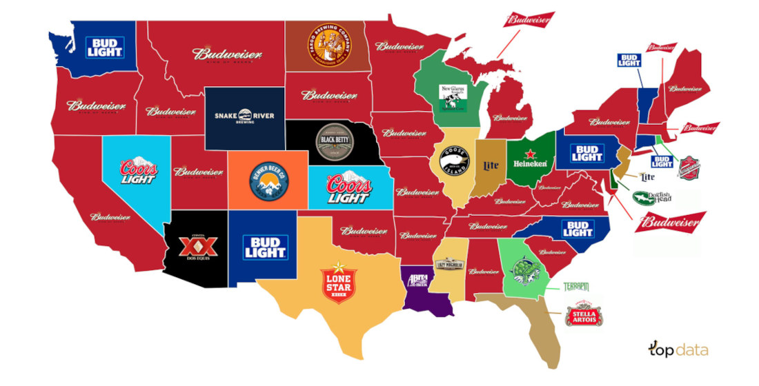
Beer: it gets you drunk. And to celebrate the nation’s increased COVID-influenced drinking problem, this is a U.S. map created by topagency highlighting each state’s most popular beer. Did you know alcohol consumption in the United States has increased almost 8.9% since the pandemic? That’s true. And, according to the
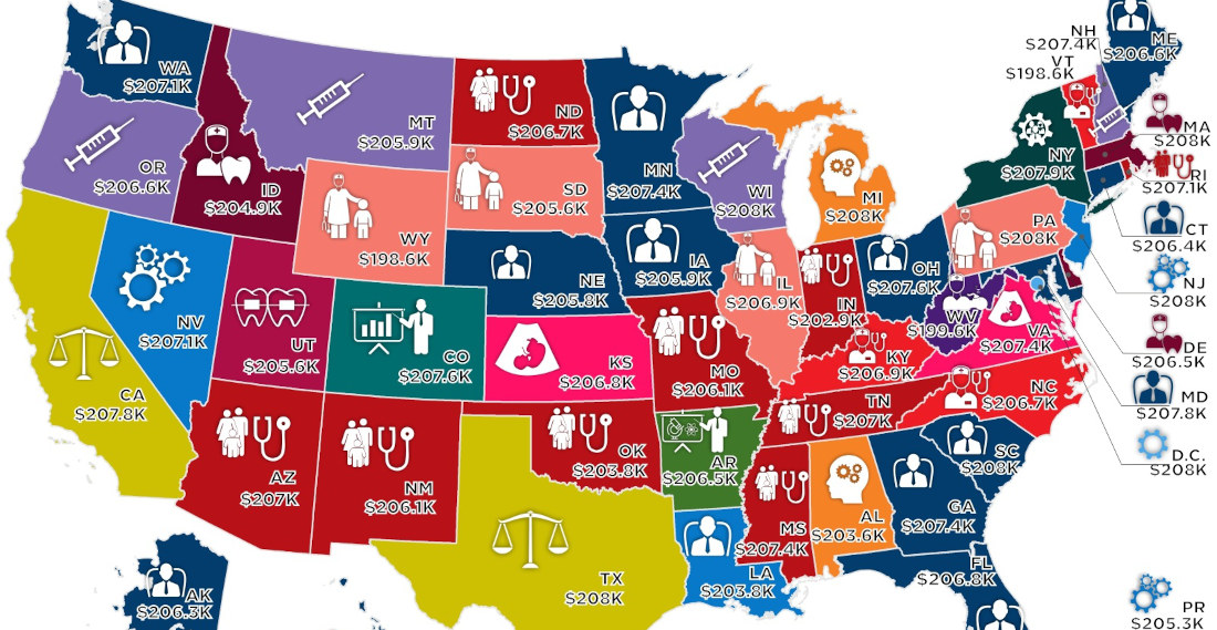
Note: Map has been cut to fit, full size version of the map with key HERE. This is a map created by howmuch.net detailing the median salary for the highest-paying job in each U.S. state. It’s interesting how all the medians are right around $206,000. From what I could gather,
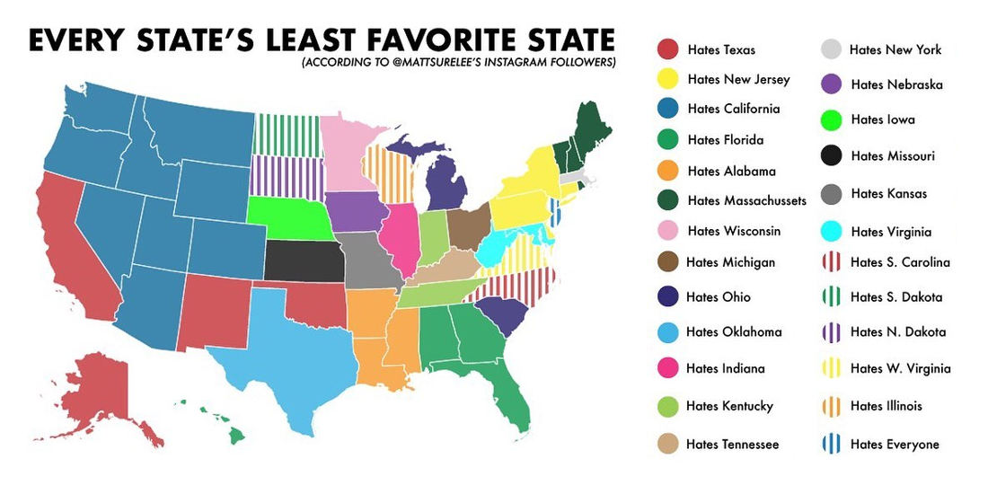
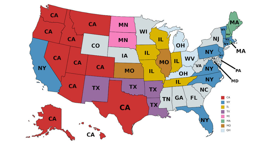
This is a US map detailing each state’s least favorite other state, as according to Instagram user mattsurelee’s 398,000 followers, so you know it’s accurate. Now I was born in West Virginia, and have lived in Alabama, Florida, Maryland, Virginia, Pennsylvania, California and New York, and as much as it
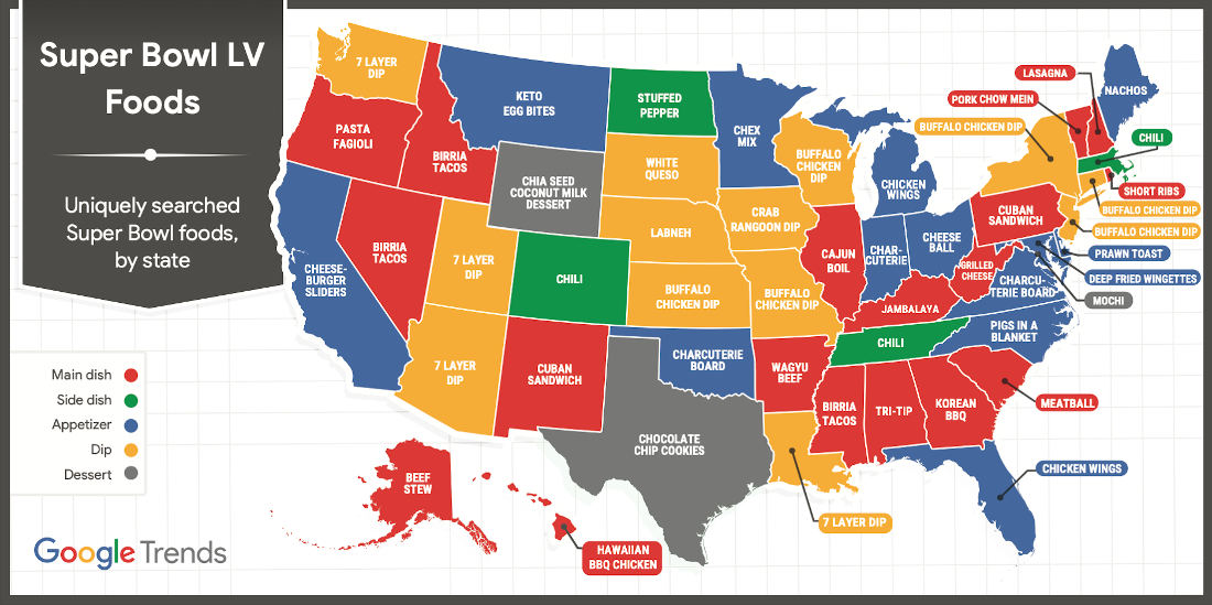
Well, the Super Bowl is Sunday, and you know what that means: I have a lot of money riding on the game. If the Panthers can’t make this one happen I’m gonna be out a LOT of money. “It’s not looking good.” Don’t say that! This is a map created
This is a map detailing where the most out-of-state residents of each particular state come from. I learned a lot by looking at it. Mostly that Californians refuse to move any further east than Texas. Or maybe they all just run out of gas money there after having their dreams

Note: Full-size version of each map below. These are two US maps detailing the best and worst attractions in each state, as according to chart maker and Instagrammer Mattsurree’s 309,200 followers. Or at least those willing to provide an answer. So, yeah, it’s questionable. Obviously– “You would have voted your


- April 29, 2024

- April 29, 2024