
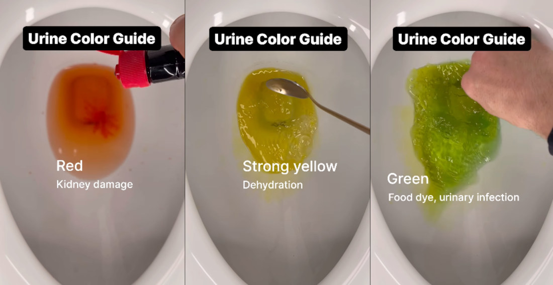
As part of my ongoing commitment to public health, this is a video from emergency medical service provider Kieram Litchfield detailing what different colored urine means about your health, adding food coloring to toilet water and stirring the faux-pee with what I assume is a roommate’s cereal spoon. From kidney
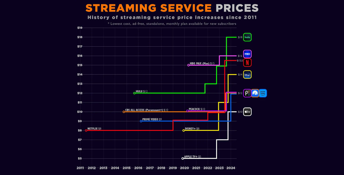
Because everything is a racket, this is visualization of the price increases across streaming platforms since Netflix’s introduction in 2011. Where’s that $1.50 CostCo hot dog guy when you really need him? I learned a lot by studying the chart. Mostly, that ever since cutting the cord, everyone that I
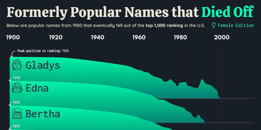
Previously: the men’s name version. In news that shouldn’t surprise anyone who didn’t recently move from an assisted living facility to a new home in the ground, this is a list of ten once popular girl’s names that have fallen out of fashion in the past century. Honestly, it’s hard
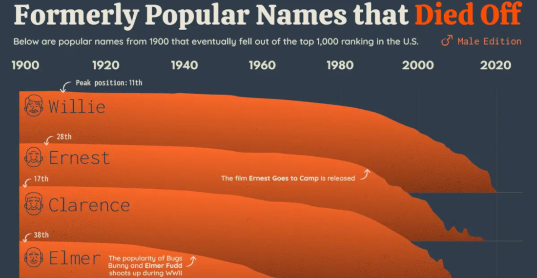
This is a chart detailing ten men’s names that were wildly fashionable in the early 20th century, but have since plunged in popularity. It’s like me in high school versus now. I’m kidding, I was never popular. There aren’t really any surprises on the list, presumably because parents today have
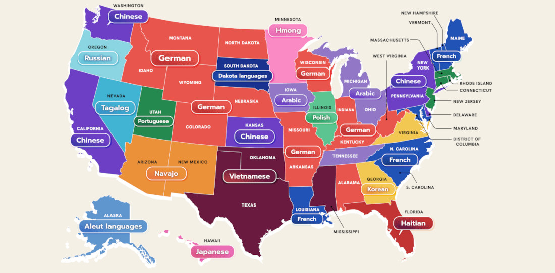
This is a US map created by WordFinderX detailing the most spoken language in each state besides English and Spanish. I learned a lot little by looking at it. Mostly, that it’s a shame my native language isn’t more prevalent anywhere. “And what language would that be?” The language of
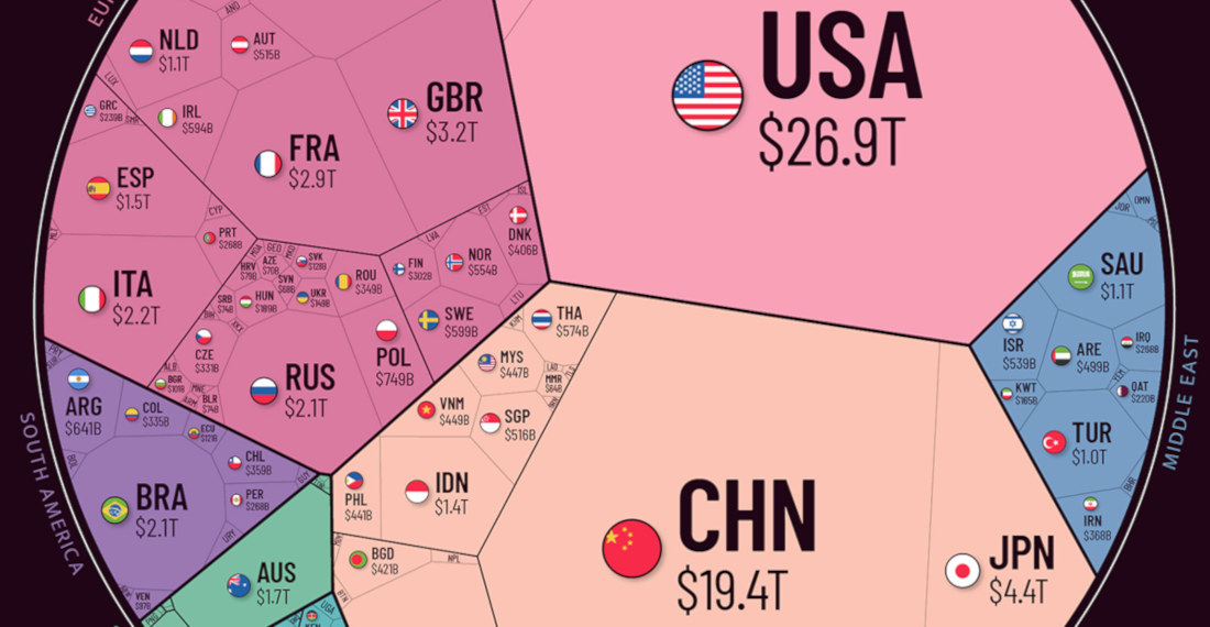
Note: The image has been cut, view the full version HERE so you can really see the Illuminati at work. This is a sort of polygonal pie chart depicting the world economy (link with a lot more info), broken into regions and the countries within those regions. As you can

This is a video produced by WIRED of DJ Shorkut discussing and demonstrating fifteen different levels of turntablism of increasing difficulty, explaining how to perform each one as he goes along. It was pretty interesting, and from what I could gather watching, all my friends who are DJs who I’ve

This is a video from Insider (previously) of marine biologist and shark scientist Amani Webber-Schultz rating ten different shark attacks (and shark scenes in general) from movies and TV shows based on their realism, dropping tons of shark knowledge in the water along the way like chum. Contestants include Jaws,
- April 17, 2024

- April 16, 2024


- April 16, 2024

- April 15, 2024