

This is a 3D visualization created by Popular Science comparing the weights of Pokemon to real animals that weigh the same to give a better sense of their heft. Some more info to prove somebody actually spent time thinking about this: If Pokémon existed in the wild, which animals would
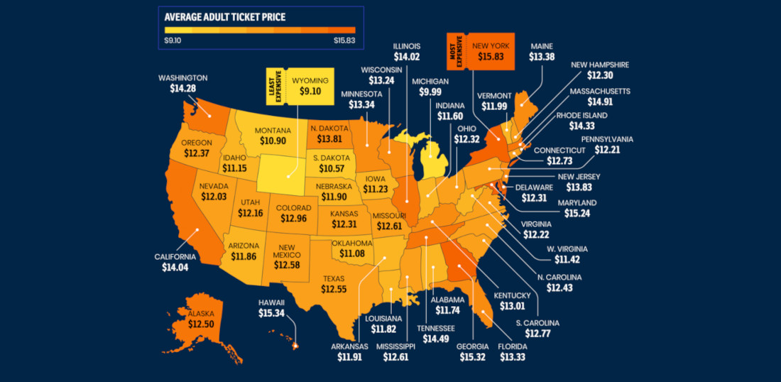
This is a map detailing the average cost of an adult movie ticket (that is, the price for an adult to see a movie, not the price of seeing an ADULT movie, those vary widely but I have paid as low as 25¢) in each US state. So, if cheap
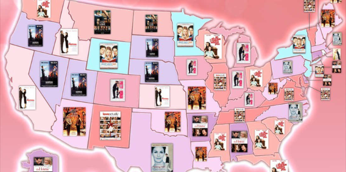
To celebrate Valentine’s Day the only way I know how (with an underwhelming blog post), this is a map of the U.S. detailing each state’s favorite rom-com movie according to Google Trends data (see below for a much better breakdown). What’s your state’s favorite? I was more than a little
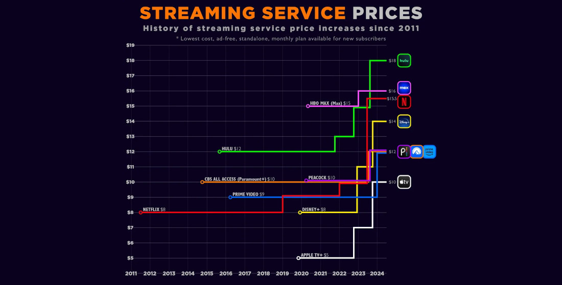
Because everything is a racket, this is visualization of the price increases across streaming platforms since Netflix’s introduction in 2011. Where’s that $1.50 CostCo hot dog guy when you really need him? I learned a lot by studying the chart. Mostly, that ever since cutting the cord, everyone that I
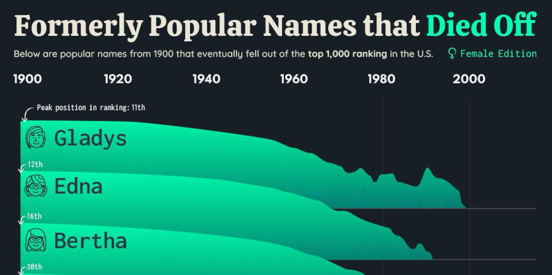
Previously: the men’s name version. In news that shouldn’t surprise anyone who didn’t recently move from an assisted living facility to a new home in the ground, this is a list of ten once popular girl’s names that have fallen out of fashion in the past century. Honestly, it’s hard
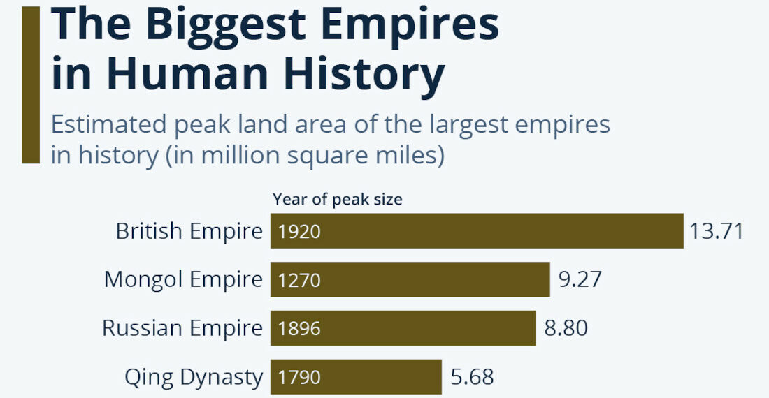
Sure, you probably think about the Roman Empire all the time, but how does it stack up against the largest empires in the history of mankind, ranked by total land area in million square miles? SPOILER: Not very well at all, it didn’t even make the top 8! Pfft, some
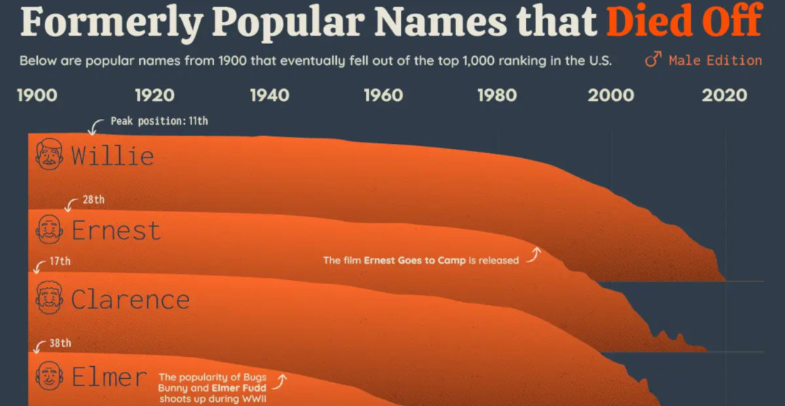
This is a chart detailing ten men’s names that were wildly fashionable in the early 20th century, but have since plunged in popularity. It’s like me in high school versus now. I’m kidding, I was never popular. There aren’t really any surprises on the list, presumably because parents today have
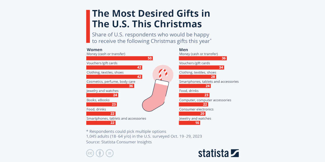
Unsurprisingly, the most popular gifts for both men and women is money and gift cards, so they can buy what they actually want instead of whatever you were going to get them because, I don’t know if you knew this about yourself or not, but you’re not the best gifter.

- April 22, 2024


- April 19, 2024