
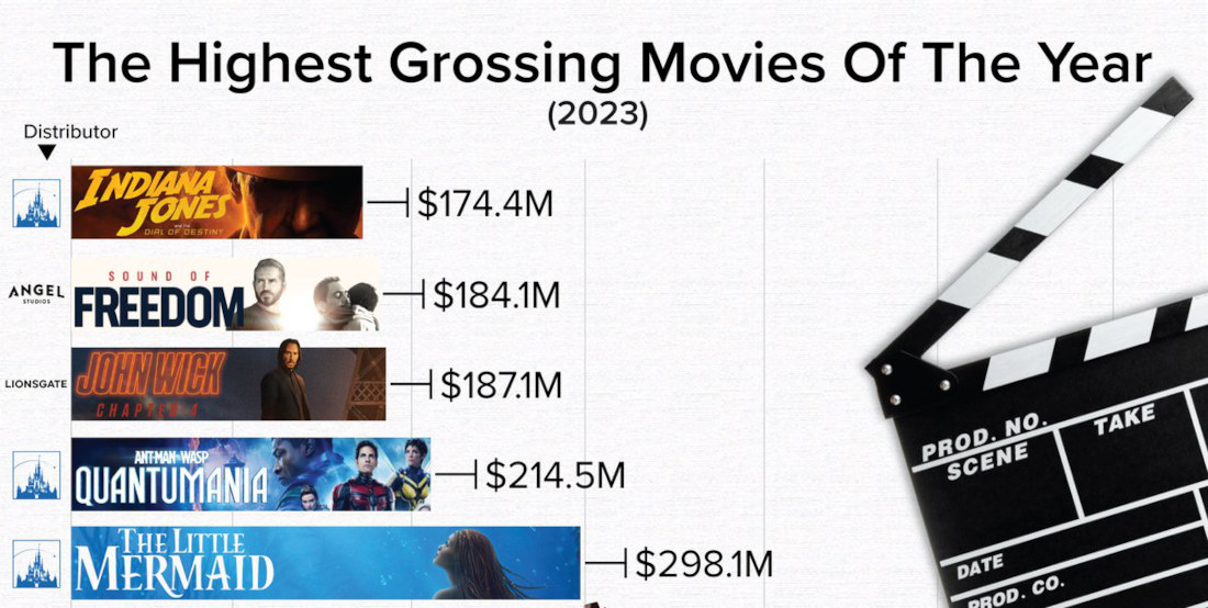
Note: full chart below. As 2023 rapidly comes to an end, this is a chart from StatsPanda of the top 10 highest grossing movies of the year, with the top two places (Barbie and Super Mario) both being based on things we played with as kids. How about that! So,
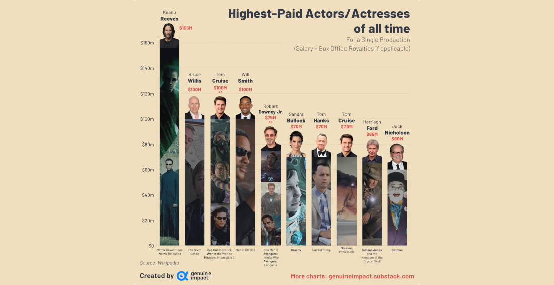
This is a chart created by Genuine Impact detailing the top 10 highest paid actors for a single performance in a movie (with Tom Cruise getting paid $100 million for three separate performances, and Robert Downey Jr., $70 million), including salary and box office royalties (where applicable). Personally, I would
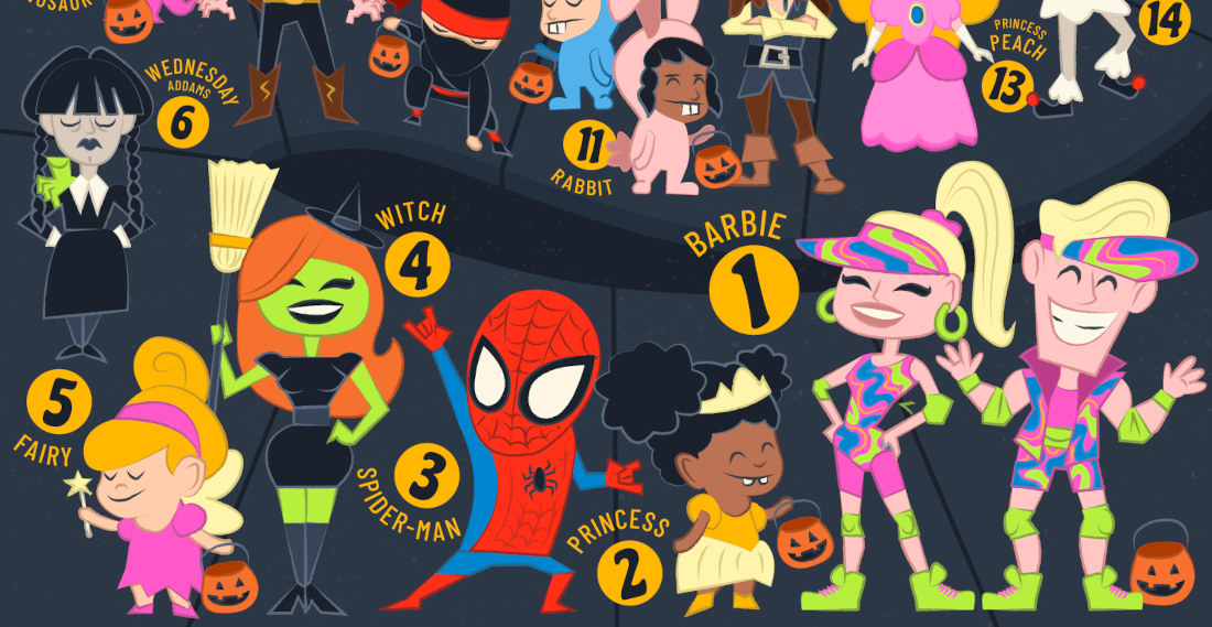
Using Google’s Frightgeist search trend data, Visual Capitalist created this graphic of the top 27 most searched for Halloween costumes of 2023. And, after a very brief scroll of my Facebook feed from over the weekend, I can confirm that these are, in fact, what people are wearing this year.
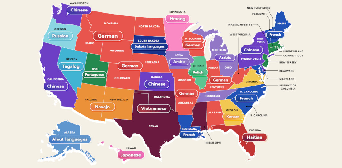
This is a US map created by WordFinderX detailing the most spoken language in each state besides English and Spanish. I learned a lot little by looking at it. Mostly, that it’s a shame my native language isn’t more prevalent anywhere. “And what language would that be?” The language of
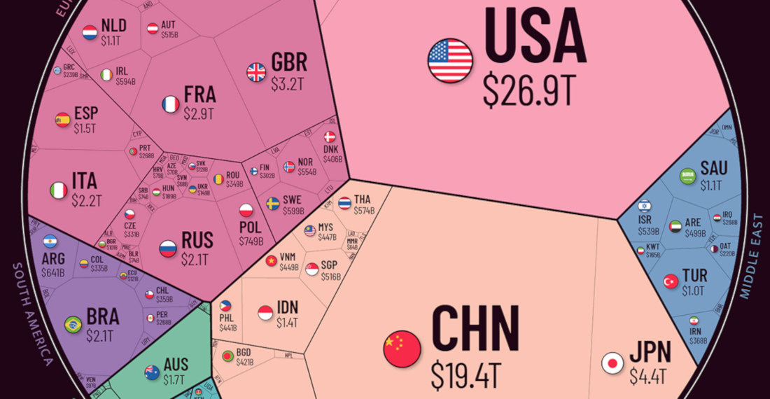
Note: The image has been cut, view the full version HERE so you can really see the Illuminati at work. This is a sort of polygonal pie chart depicting the world economy (link with a lot more info), broken into regions and the countries within those regions. As you can
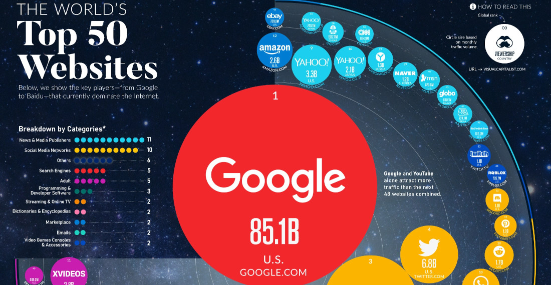
Note: Image has been cut, click HERE to see the full-size image. Using data collected from Similarweb, this is a visualization created by VisualCapitalist of the world’s top 50 most visited websites, based on monthly traffic volume. As you can see, Borninspace did not make the cut. I assume it’s
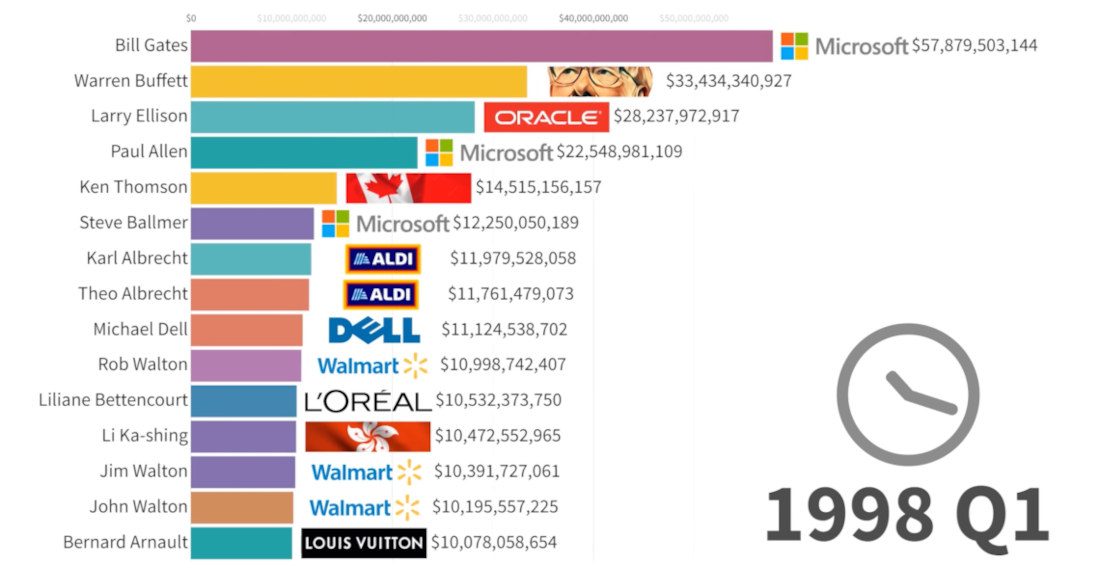
This is an animated bar graph visualizing the world’s fifteen richest people (royalty excluded) from 1985 – 2023, with their associated companies also highlighted. I learned a lot by watching it. Mostly, that even the poorest of these people is entirely too rich. I don’t even have any money and
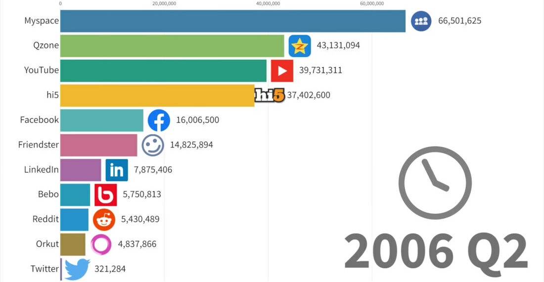
This is a bar graph visualization detailing the most popular social networks from 2003 – 2022, measured by monthly active users worldwide. Remember 2006? Back when MySpace was king and Twitter was just being born. Things sure have changed, haven’t they? For the worse, just to be clear.

- April 15, 2024