
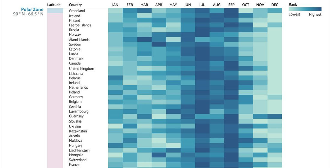
Note: Chart cut for brevity, keep going for the whole thing. This is a visualization created by the chart and graph makers at Visme of the most common birth months for countries around the world, grouped into latitudinal geographic zones. I learned a lot by looking at it. Mostly, that

- April 17, 2024

- April 16, 2024


- April 16, 2024

- April 15, 2024