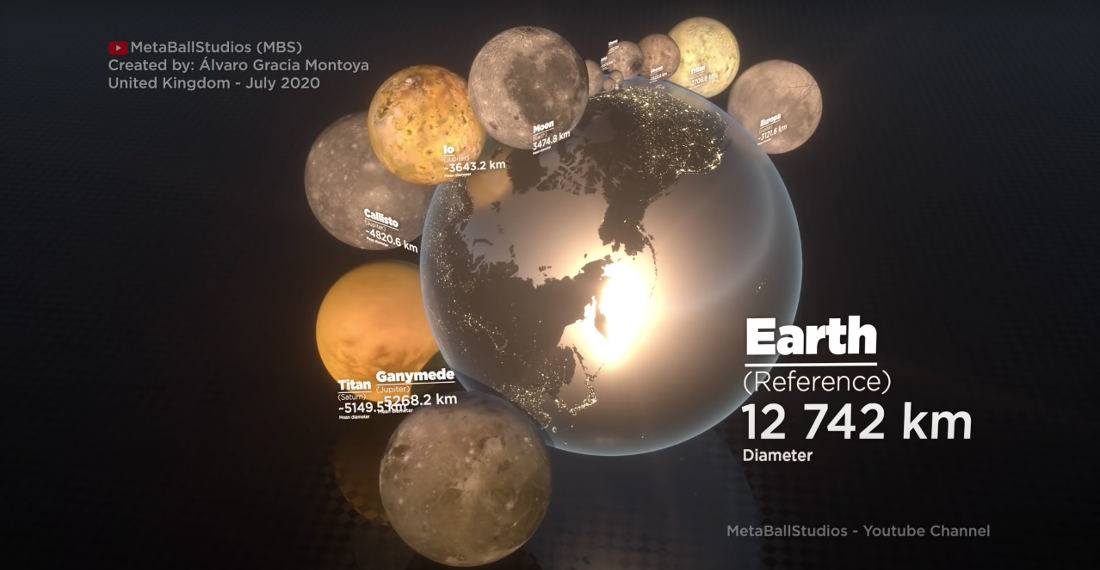
This is a visualization created by MetaBallStudios comparing the sizes of the natural satellites that exist in our solar system, first using New York City as a size reference, then the entire earth. So — what moon is your favorite? “The Death Star.” That’s no moon! “LOL.” LOLOL. Hey let’s take turns throwing rocks at each other.


- April 19, 2024


- April 17, 2024