
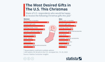
Unsurprisingly, the most popular gifts for both men and women is money and gift cards, so they can buy what they actually want instead of whatever you were going to get them because, I don’t know if you knew this about yourself or not, but you’re not the best gifter.
hite
- December 5, 2023

This is a comparison video from Red Side (previously), this time comparing the top speeds of various species of birds (whether walking or running). It begins with the slow 2.4MPH march of the penguin, and works its way all the way up to 242MPH dive of the peregrine falcon. Damn,
- November 27, 2023
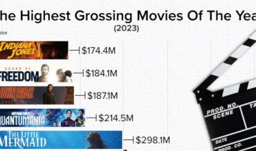
Note: full chart below. As 2023 rapidly comes to an end, this is a chart from StatsPanda of the top 10 highest grossing movies of the year, with the top two places (Barbie and Super Mario) both being based on things we played with as kids. How about that! So,
- November 15, 2023
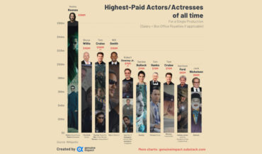
This is a chart created by Genuine Impact detailing the top 10 highest paid actors for a single performance in a movie (with Tom Cruise getting paid $100 million for three separate performances, and Robert Downey Jr., $70 million), including salary and box office royalties (where applicable). Personally, I would
- October 30, 2023

Using Google’s Frightgeist search trend data, Visual Capitalist created this graphic of the top 27 most searched for Halloween costumes of 2023. And, after a very brief scroll of my Facebook feed from over the weekend, I can confirm that these are, in fact, what people are wearing this year.
- October 30, 2023
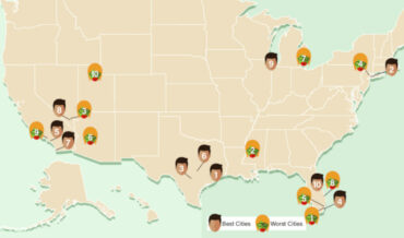
Created by the zombie apocalypse survival experts at lawncare service provider LawnLove (wait, what?), this is a US map detailing what they believe to be the best and worst cities in the US for surviving a zombie apocalypse. Zombies: they don’t f*** with Texas. Also a lot of the best
- September 7, 2023
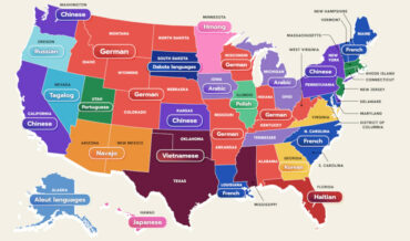
This is a US map created by WordFinderX detailing the most spoken language in each state besides English and Spanish. I learned a lot little by looking at it. Mostly, that it’s a shame my native language isn’t more prevalent anywhere. “And what language would that be?” The language of
- September 5, 2023
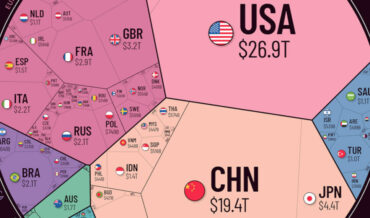
Note: The image has been cut, view the full version HERE so you can really see the Illuminati at work. This is a sort of polygonal pie chart depicting the world economy (link with a lot more info), broken into regions and the countries within those regions. As you can
- August 11, 2023