
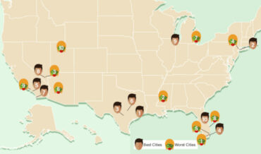
Created by the zombie apocalypse survival experts at lawncare service provider LawnLove (wait, what?), this is a US map detailing what they believe to be the best and worst cities in the US for surviving a zombie apocalypse. Zombies: they don’t f*** with Texas. Also a lot of the best
hite
- September 7, 2023
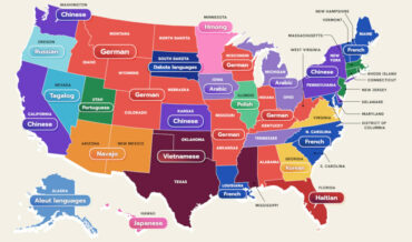
This is a US map created by WordFinderX detailing the most spoken language in each state besides English and Spanish. I learned a lot little by looking at it. Mostly, that it’s a shame my native language isn’t more prevalent anywhere. “And what language would that be?” The language of
- September 5, 2023
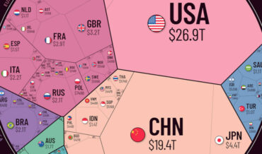
Note: The image has been cut, view the full version HERE so you can really see the Illuminati at work. This is a sort of polygonal pie chart depicting the world economy (link with a lot more info), broken into regions and the countries within those regions. As you can
- August 11, 2023
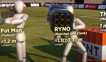
Back with another size comparison visualization, this is a video from MetaBallStudios (previously) comparing the sizes of numerous weapons from pop culture, from tiny rings and handguns to massive space station sized superweapons. Obviously, comparing a rifle directly to the Death Star would be like comparing apples to an orchard,
- July 5, 2023

Our sun: in the grand scheme of stars in the universe, there’s really nothing that special about it. It’s only special to us and our life here on earth. It’s just an average yellow dwarf, the sort of sun that would float under everyone’s radar in high school. And this
- May 2, 2023
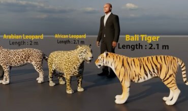
Because a moving picture is worth at least 100,000 words, this is a video comparing the sizes of various felines, from the 14″ rusty spotted cat, to the 13.4′ extinct Ngandong tiger. The felines really start looking unfriendly around the 1:10 mark. Of course size doesn’t always matter, and my
- April 12, 2023
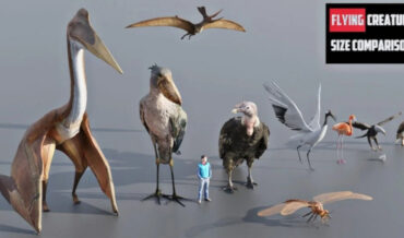
This is a visualization created by Global Data comparing the sizes of various flying creatures both extinct and extant, but mostly extinct because Mother Nature made all the wildest models back in the day. Don’t get wrong, she’s still got some pretty crazy designs in existence, but she’s definitely grown
- April 10, 2023

This is a visualization created by Youtube channel WTD comparing the sizes of a number of different dog breeds. I learned a lot by watching it. Mostly, that I have what would be considered two small dogs, and one large dog. The small ones weigh around 13-pounds and 18 pounds.
- April 3, 2023