maps
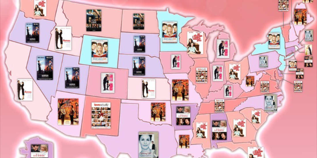
To celebrate Valentine’s Day the only way I know how (with an underwhelming blog post), this is a map of the U.S. detailing each state’s favorite rom-com movie according to Google Trends data (see below for a much better breakdown). What’s your state’s favorite? I was more than a little
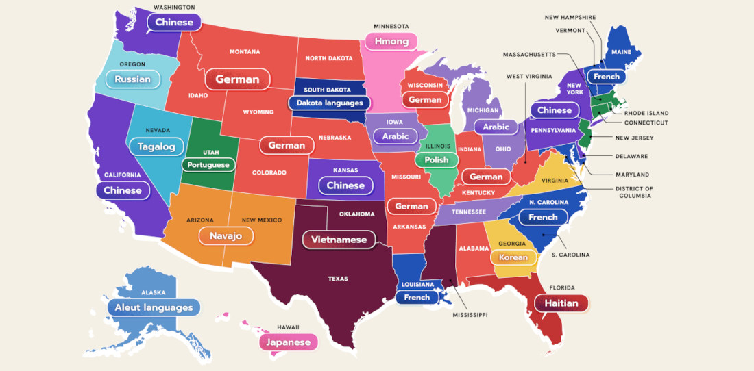
This is a US map created by WordFinderX detailing the most spoken language in each state besides English and Spanish. I learned a lot little by looking at it. Mostly, that it’s a shame my native language isn’t more prevalent anywhere. “And what language would that be?” The language of
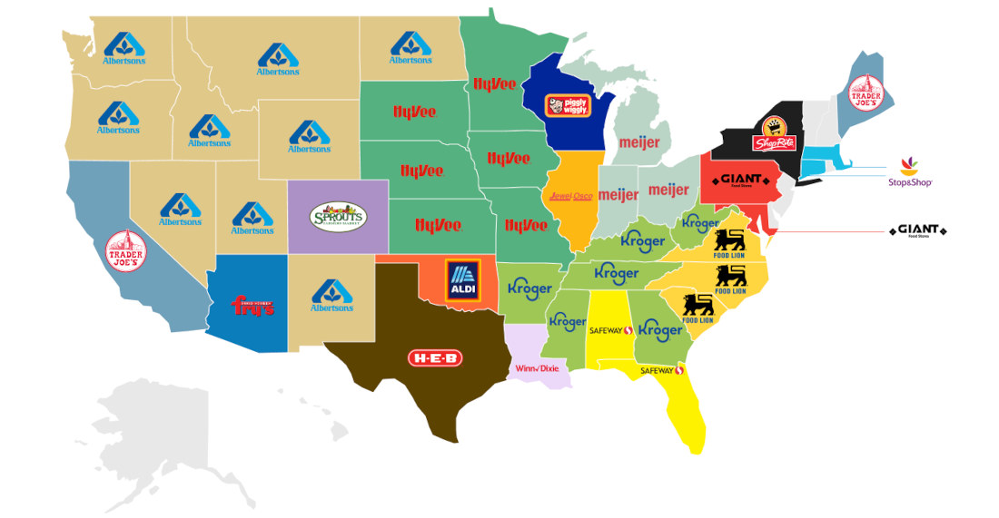
This is a US map highlighting the alleged most popular grocery store chain in each state according to a questionably conducted survey by ‘information insights platform Wise Voter‘. That’s cool, but what about the states without a grocery store listed — what about them? Do people in Vermont and Alaska
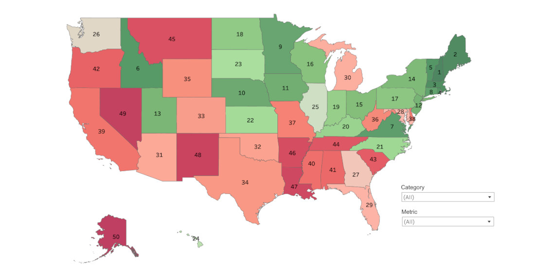
This is a US map detailing the safest to most dangerous states according to six categories: personal safety, public safety, financial safety, mental health, transportation and infrastructure, and public safety. Each state was ranked 1 – 50 in 39 different metrics, and the findings combined for category rank, and overall
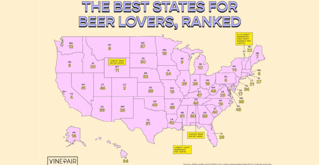
This is a US map created by VinePair (link with a lot more info and breakdown) featuring a ranking of the best (and worst) states for beer lovers. Each state was ranked according to the following criteria, and not just subjectively like I would have done: -The number of craft
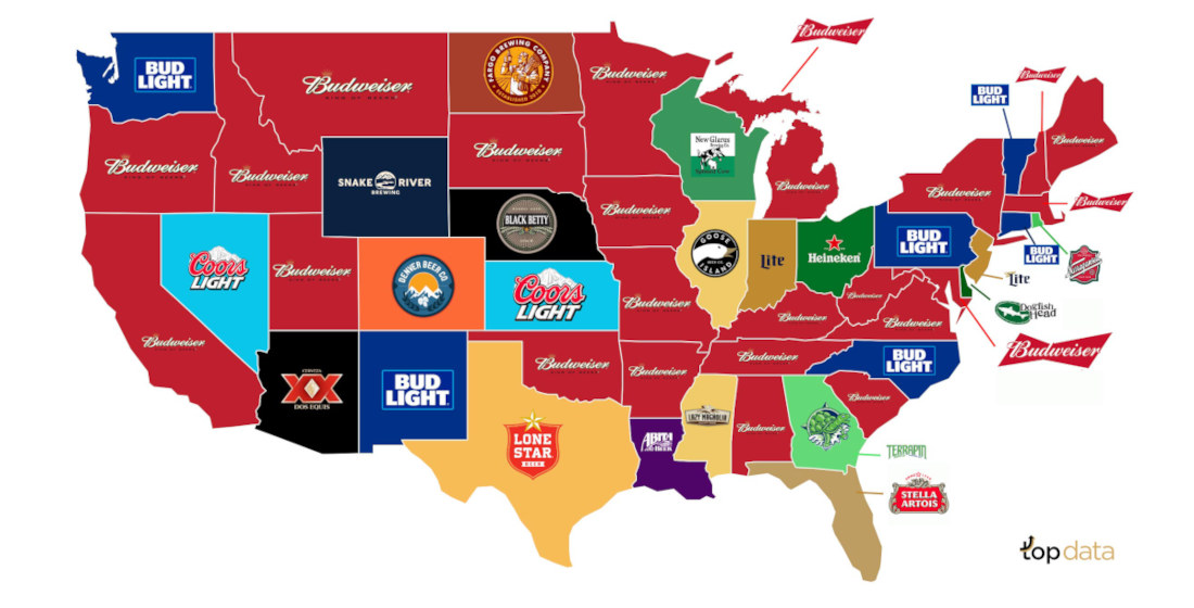
Beer: it gets you drunk. And to celebrate the nation’s increased COVID-influenced drinking problem, this is a U.S. map created by topagency highlighting each state’s most popular beer. Did you know alcohol consumption in the United States has increased almost 8.9% since the pandemic? That’s true. And, according to the
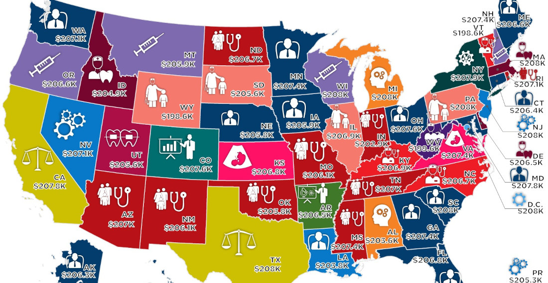
Note: Map has been cut to fit, full size version of the map with key HERE. This is a map created by howmuch.net detailing the median salary for the highest-paying job in each U.S. state. It’s interesting how all the medians are right around $206,000. From what I could gather,
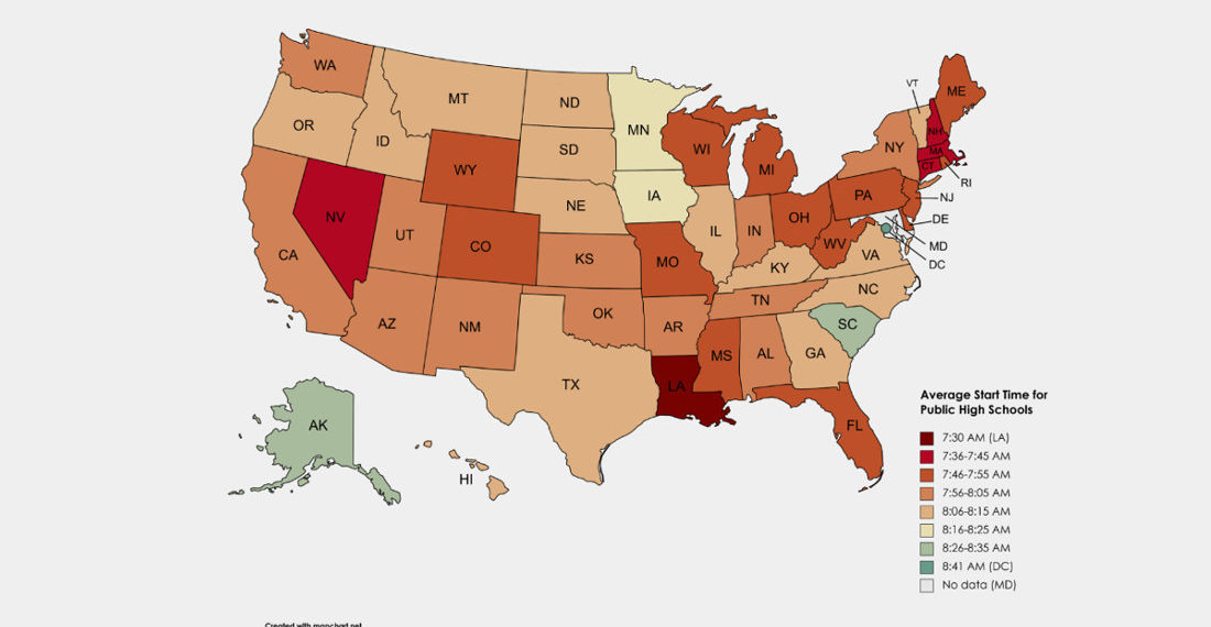
This is a US map detailing the average morning start time for public schools by state. As you can see, after factoring in a bus ride, any state that isn’t at least healthy urine yellow is starting what would be considered by any ethics committee weighing in on the subject
Things people say
- Eric Ord on Find The Frog
- Kent on Maserati SUV Driver Mistakes His Vehicle For Functional Off Roader, Gets Stuck In Flood
- born in space on Mouse Sneaks Out Of Hiding Spot In Stove To Steal An OREO
- 1-Ton on Footage Of Statue Of Liberty Shaking During The Recent Earthquake
- Enkidu98 on Pacers Use Filter To Make Lakers Fans Cry On Jumbotron During Defeat
- April 17, 2024
- April 16, 2024
- April 16, 2024
- April 15, 2024
