
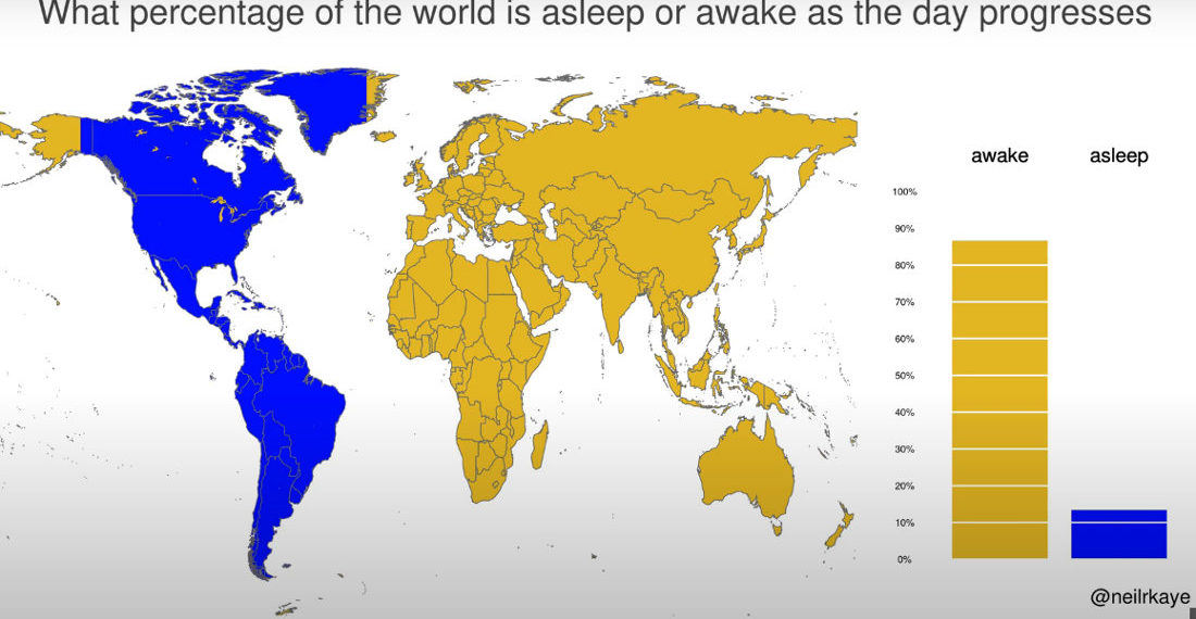
This is a visualization created by climate data scientist Neil Kaye using a world map to detail what percentage of the world’s population is asleep or awake at any given hour (assuming nightly 8 hour sleep periods). I learned a lot by looking at it. Mostly, that when the US
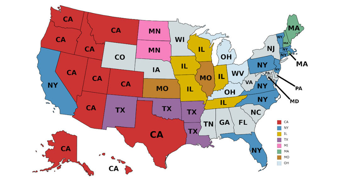
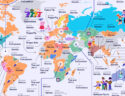
This is a map detailing where the most out-of-state residents of each particular state come from. I learned a lot by looking at it. Mostly that Californians refuse to move any further east than Texas. Or maybe they all just run out of gas money there after having their dreams
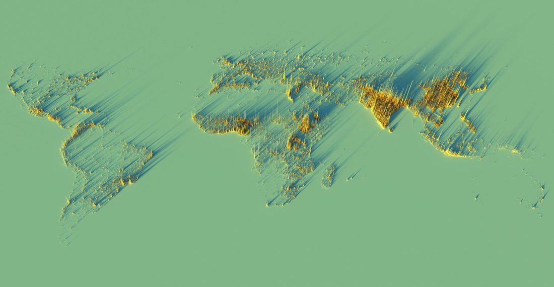
Created by former professor of urban studies Alasdair Rae of Sheffield, England, this is a 3D visualization of the world’s population density. As you can see, along all the coasts are generally very popular places to live. Also, absolutely everywhere in Asia. If there’s dry land to walk on there,
Size: does it matter? It’s a question that’s been raging on since the days of chickens and eggs. I say it does, but my girlfriend insists it doesn’t, presumably just to make me feel better. This is a visual comparison created by Youtuber MrRanker of some of the largest and

Note: Full-size version of each map below. These are two US maps detailing the best and worst attractions in each state, as according to chart maker and Instagrammer Mattsurree’s 309,200 followers. Or at least those willing to provide an answer. So, yeah, it’s questionable. Obviously– “You would have voted your


- April 29, 2024

- April 29, 2024

- April 26, 2024