

This is a video from photographer Uly Huerta featuring a thirty minute uninterrupted walk through the various districts of Osaka, Japan, including the “shopping districts of Namba and Nipponbashi, the new world district of Shinsekai, and the residential area of Joto-ku.” It was nice and relaxing. I almost felt like
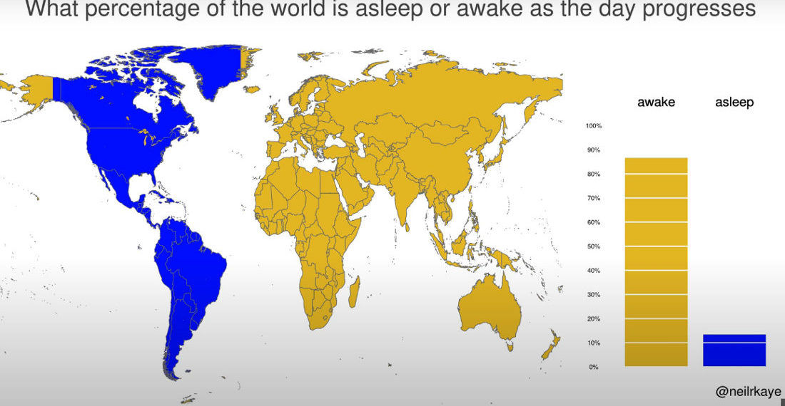
This is a visualization created by climate data scientist Neil Kaye using a world map to detail what percentage of the world’s population is asleep or awake at any given hour (assuming nightly 8 hour sleep periods). I learned a lot by looking at it. Mostly, that when the US
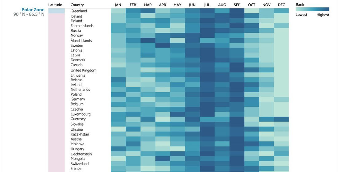
Note: Chart cut for brevity, keep going for the whole thing. This is a visualization created by the chart and graph makers at Visme of the most common birth months for countries around the world, grouped into latitudinal geographic zones. I learned a lot by looking at it. Mostly, that
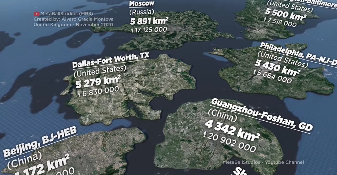
This is a visualization created by MetaBallStudios (previously) of the size of various cities around the globe as measured by total urban area and not just “city proper (administrative) or metropolitan area.” There are some big-ass cities in the world! Honestly, I had a hard time even fathoming the size


- April 29, 2024

- April 29, 2024