
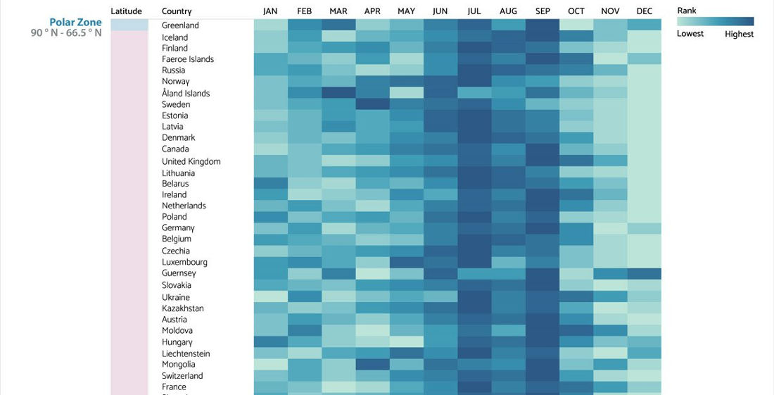
Note: Chart cut for brevity, keep going for the whole thing. This is a visualization created by the chart and graph makers at Visme of the most common birth months for countries around the world, grouped into latitudinal geographic zones. I learned a lot by looking at it. Mostly, that

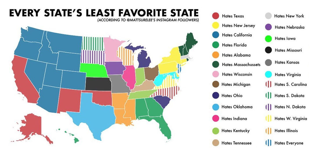
This is a US map detailing each state’s least favorite other state, as according to Instagram user mattsurelee’s 398,000 followers, so you know it’s accurate. Now I was born in West Virginia, and have lived in Alabama, Florida, Maryland, Virginia, Pennsylvania, California and New York, and as much as it
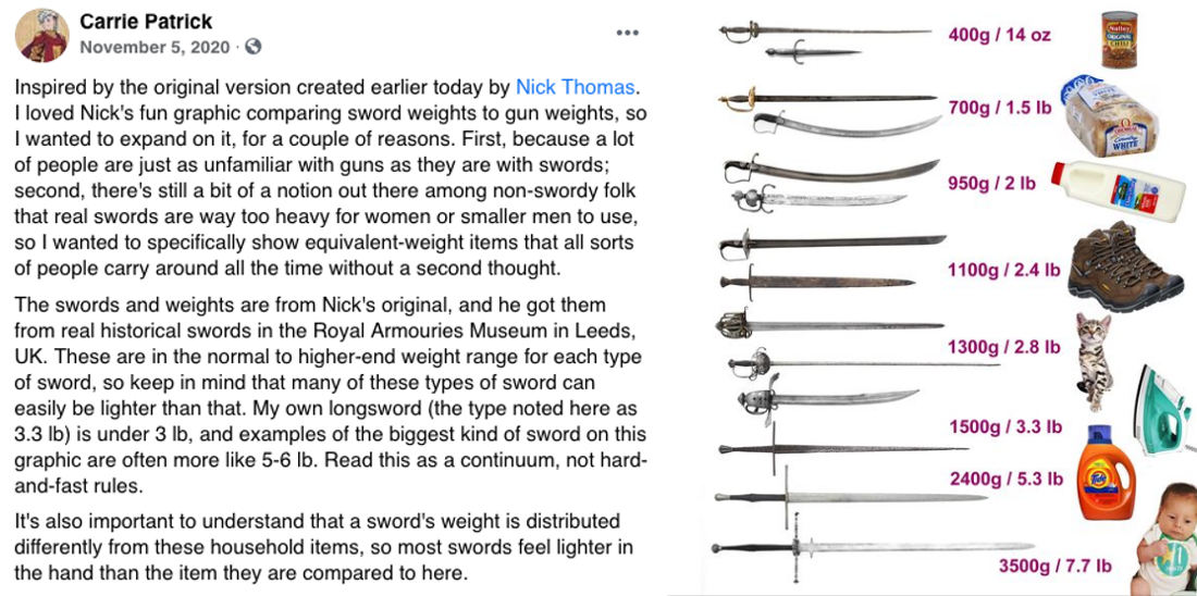
This is a graphic created by Carrie Patrick comparing the weights of various swords to common household objects like cans of chili, loaves of bread, boots, and children. Children thankfully not being that common a household object in my home aside, I learned a lot by looking at the chart.
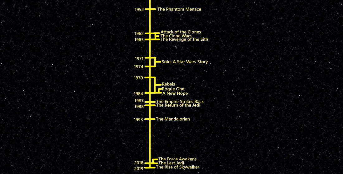
To put things into perspective, this is a timeline of the major Star Wars movies and shows relative to our own real timeline from 1952 – 2019. I learned a lot by looking at it. Mostly, that according to my calculations it would appear Anakin is old enough to be
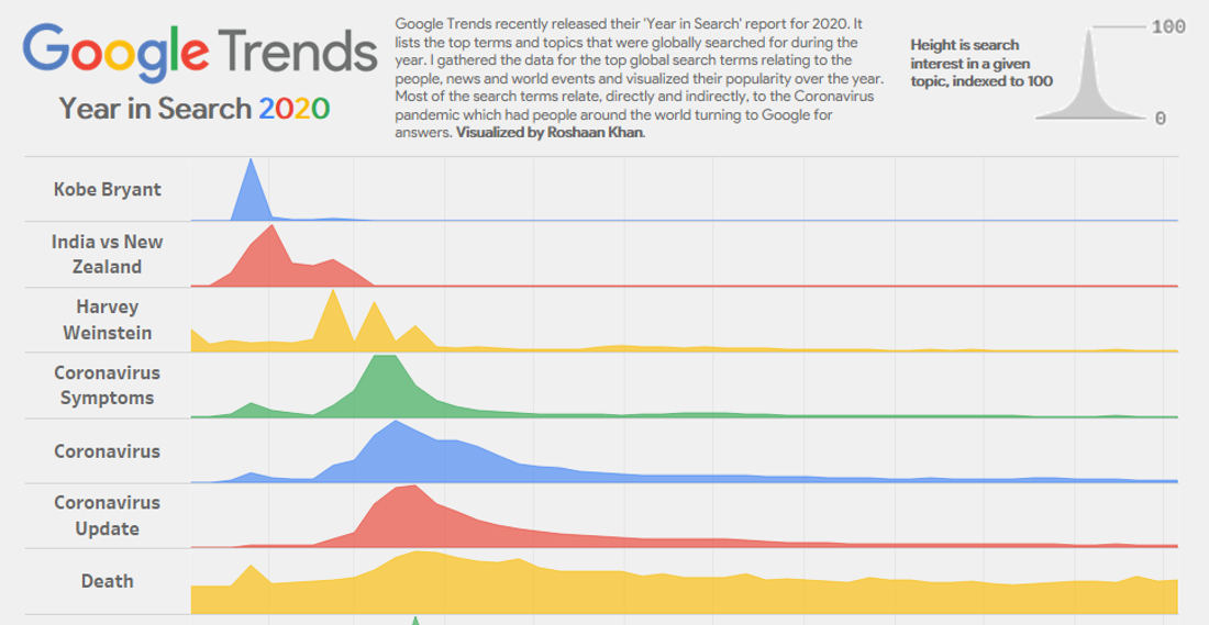
Note: this isn’t the whole thing, see below for the entire graph. This is a visualization created by Roshaan Khan detailing the top global Google search queries for 2020, using the data from Google Trends’ ‘Year In Search’ report. As you can see, people are very quick to lose interest
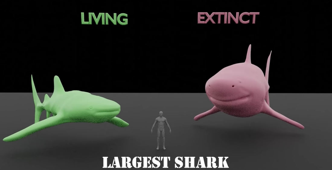
This is a 3D visualization comparing the size of the largest living versus extinct animals of the same species, with a human standing there for reference/to keep the predators’ attention. In almost all cases, there was a larger species that has since gone extinct. I mean, if you believe the
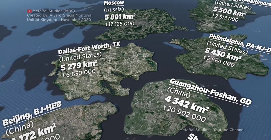
This is a visualization created by MetaBallStudios (previously) of the size of various cities around the globe as measured by total urban area and not just “city proper (administrative) or metropolitan area.” There are some big-ass cities in the world! Honestly, I had a hard time even fathoming the size
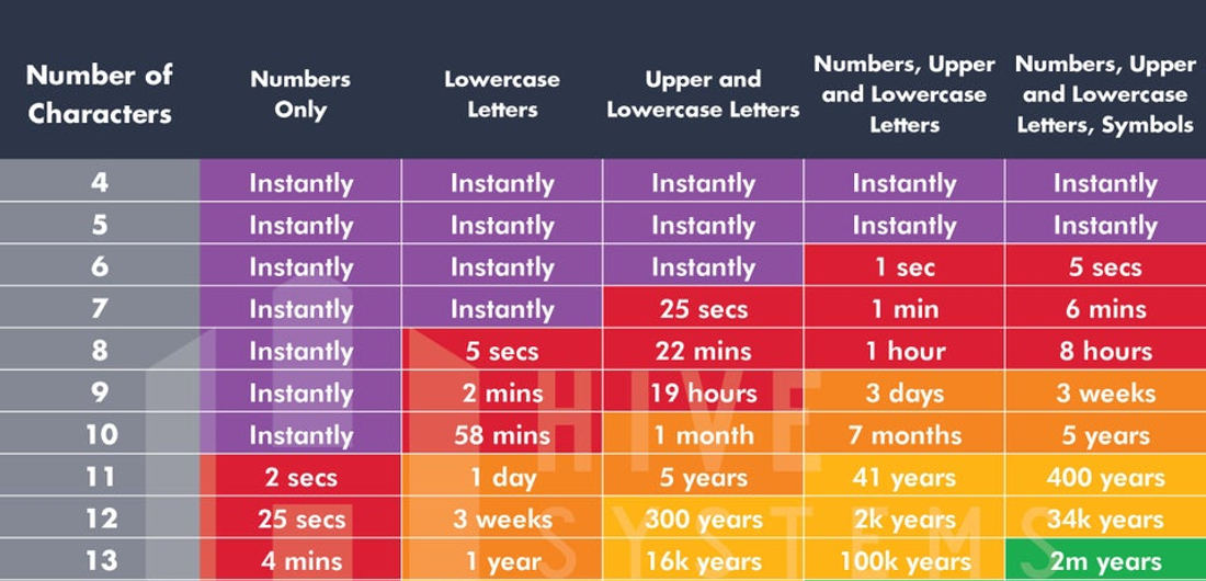
Note: Not the whole chart, keep going to see the whole thing down to 18 characters. This is a chart detailing how long it would take a brute force password program (a program that “systematically attempts every possible permutation of the letters, numbers and symbols involved in the password”) to


- October 8, 2026

- October 7, 2026

- October 6, 2026