
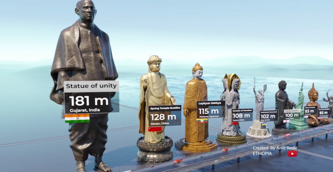
This is a visualization video from Youtube channel Real Data comparing the heights of the world’s tallest statues. I learned a lot by watching it. Mostly, that my penis dwarfs all of these and I should only make love to constellations. Granted I was already pretty sure before, but now

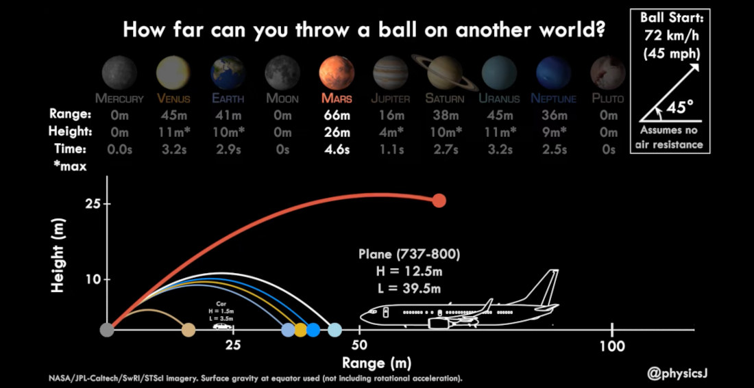
This is a video from Japan Aerospace Exploration Agency (JAXA) planetary astronomer Dr. James O’Donoghue (previously), detailing how far you’d be able to throw a ball on other planets compared to on earth. I learned a lot by watching it. Mostly, that I’m not convinced I could even throw a
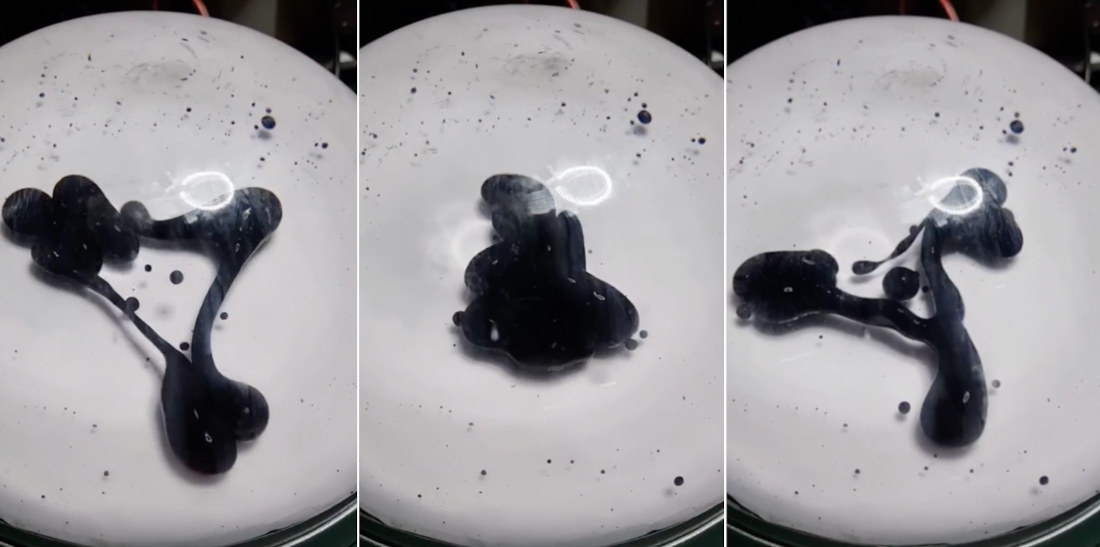
Note: Make sure the video’s volume is on. Working similarly to the one previously developed by DAKD Jung, this is a video of a ferrofluid visualizer built by Redditor Sergey Kuznetsov featuring a magnetic solution suspended in a clear liquid that “dances” to music as a magnet behind it is
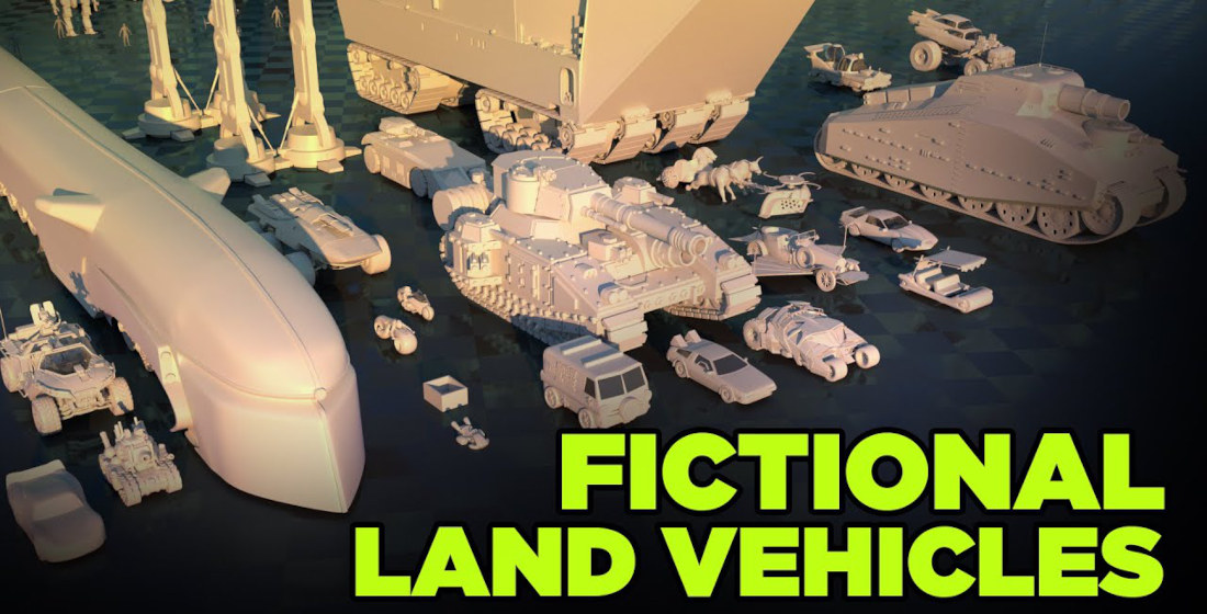
This is another 3D size comparison visualization from MetaBall Studio (previously), this time comparing the sizes of various fictional land vehicles from pop culture. Which vehicle is your favorite? Anything is better than my car, mostly because I don’t have one and my girlfriend has to drive me everywhere. I
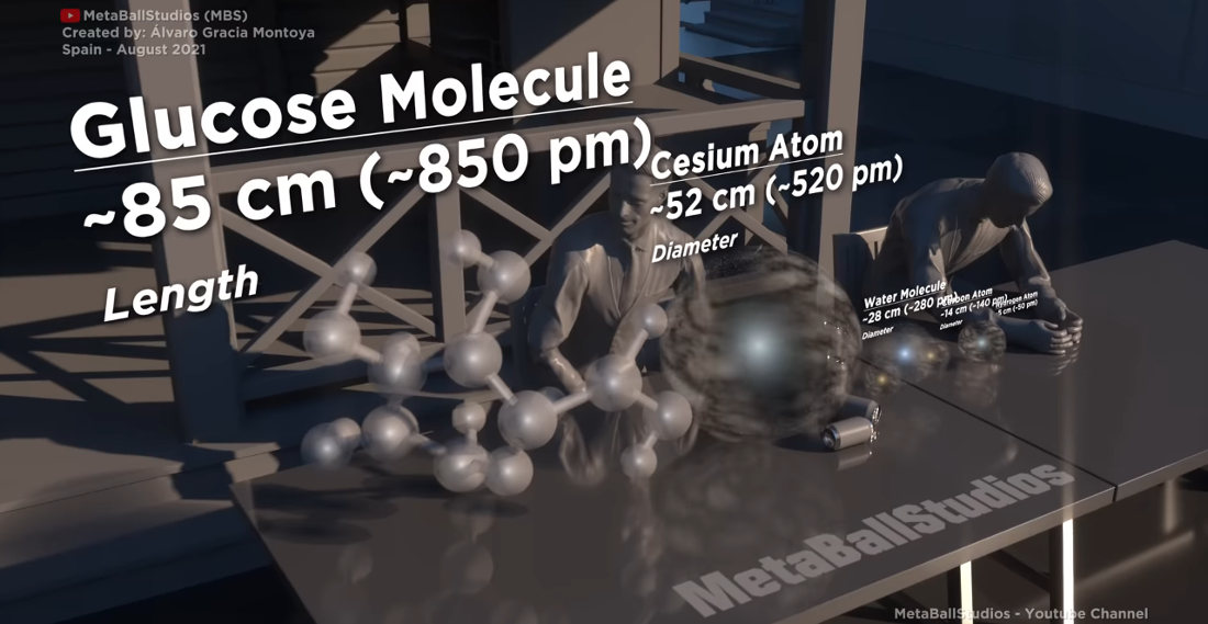
Microorganisms: do they really exist or are they just made up by scientists to explain magic? The world may never know. But this is another in MetaBallStudio’s unending series of size comparison videos (previously), this time visualizing the size of various microorganisms using humans, increasingly larger manmade objects, and eventually
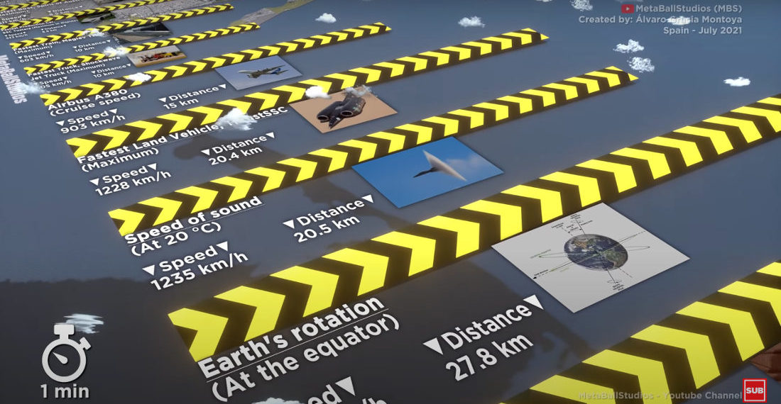
This is another visual comparison video created by MetaBallStudio (previously), this time comparing the average distance traveled in one minute by various objects in the universe, including animals, machines, planets, etc. I learned a lot by watching it. Mostly, that I’m slower than a tree sloth or Galapagos tortoise. I
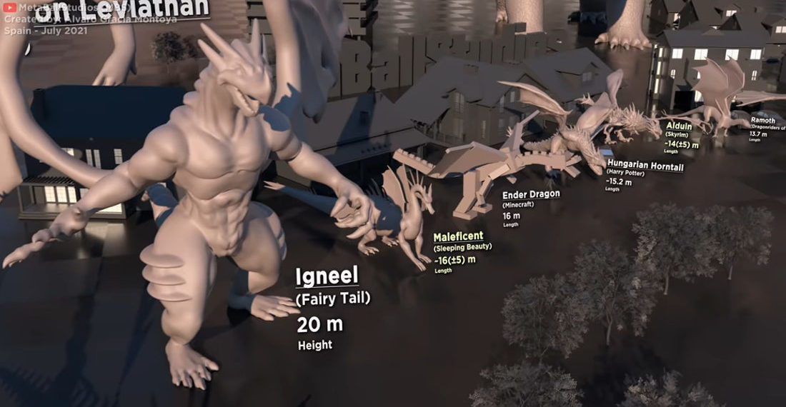
Created by visual comparer of things MetaBallStudio (previously), this is a video animation comparing the size of various dragons, starting with the diminutive ~60cm Azymondias and Mushu from The Dragon Prince and Mulan, and ending with the larger-than-galaxies Super Shenron from Dragon Ball Super. That is quite a range. So
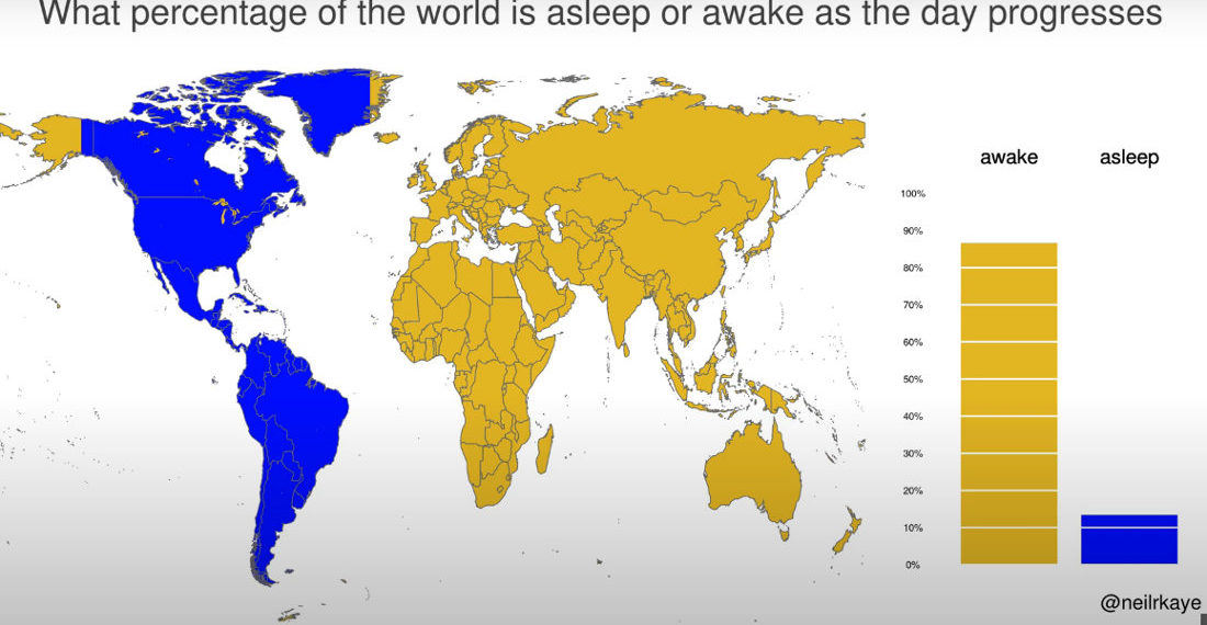
This is a visualization created by climate data scientist Neil Kaye using a world map to detail what percentage of the world’s population is asleep or awake at any given hour (assuming nightly 8 hour sleep periods). I learned a lot by looking at it. Mostly, that when the US

- October 8, 2026

- October 7, 2026

- October 6, 2026