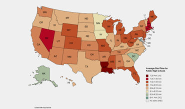
This is a US map detailing the average morning start time for public schools by state. As you can see, after factoring in a bus ride, any state that isn’t at least healthy urine yellow is starting what would be considered by any ethics committee weighing in on the subject
hite
- August 17, 2021
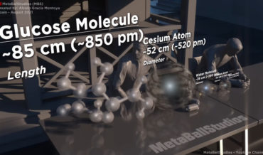
Microorganisms: do they really exist or are they just made up by scientists to explain magic? The world may never know. But this is another in MetaBallStudio’s unending series of size comparison videos (previously), this time visualizing the size of various microorganisms using humans, increasingly larger manmade objects, and eventually
- August 11, 2021
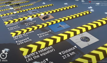
This is another visual comparison video created by MetaBallStudio (previously), this time comparing the average distance traveled in one minute by various objects in the universe, including animals, machines, planets, etc. I learned a lot by watching it. Mostly, that I’m slower than a tree sloth or Galapagos tortoise. I
- August 2, 2021
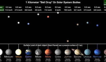
Gravity: I wish it wasn’t so strong on earth. But only for me, I wish it was doubly strong for everyone else. But enough daydreaming about me leapfrogging over everyone all day, this is a visualization created by planetary space scientist James O’Donoghue comparing the gravity on various bodies of
- July 13, 2021
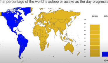
This is a visualization created by climate data scientist Neil Kaye using a world map to detail what percentage of the world’s population is asleep or awake at any given hour (assuming nightly 8 hour sleep periods). I learned a lot by looking at it. Mostly, that when the US
- July 12, 2021
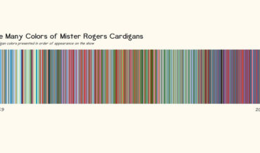
This is what will now be known as the Spectrum Of Kindness, a barcode style chart created by data lover Owen Llewellyn Henry Jean Phillips to celebrate Mister Rogers’ birthday by presenting the color of every cardigan he wore on Mister Rogers’ neighborhood in chronological order from 1969 – 2001
- April 7, 2021
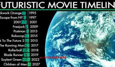
Note: Not the whole timeline, keep going to see even deeper into the future. This is a chart created by artist and animator Dan Meth featuring a timeline of futuristic movies. As you can see, we’re right between Blade Runner and Soylent Green. Of course none of this matters because
- April 1, 2021
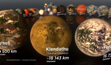
This is another size comparison video from MetaBallStudios (previously), this time comparing the size of various fictional planets found in popular culture from smallest to largest diameter. And also to things that actually exist in reality, like “New York City, Earth, the Earth’s moon, other planets in our solar system,
- March 24, 2021