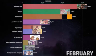
This is a racing bar chart of the most popular memes of 2021, ranked by popularity per month as according to Know Your Meme pageviews. I also included the same style of bar chart they created for all memes from 2011 – 2020, divided into yearly quarters. I learned a
hite
- January 27, 2022
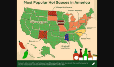
This is a US map detailing each state’s most ordered hot sauce via Instacart, using data collected by the company. As you can see, sriracha is king, followed by Franks RedHot and Cholula. Well at least Cholula made the top three. I like Tapatio too. Honestly, I’m not sure if
- January 21, 2022
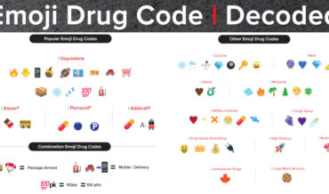
Because the Drug Enforcement Agency is clearly two steps ahead of the game, the DEA recently released a chart of emojis for parents to be aware of that may indicate their children may be purchasing and using drugs. Above is that chart. So basically all emojis mean drugs, especially the
- January 11, 2022
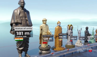
This is a visualization video from Youtube channel Real Data comparing the heights of the world’s tallest statues. I learned a lot by watching it. Mostly, that my penis dwarfs all of these and I should only make love to constellations. Granted I was already pretty sure before, but now
- January 10, 2022
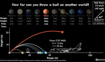
This is a video from Japan Aerospace Exploration Agency (JAXA) planetary astronomer Dr. James O’Donoghue (previously), detailing how far you’d be able to throw a ball on other planets compared to on earth. I learned a lot by watching it. Mostly, that I’m not convinced I could even throw a
- January 6, 2022
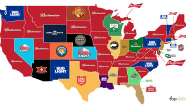
Beer: it gets you drunk. And to celebrate the nation’s increased COVID-influenced drinking problem, this is a U.S. map created by topagency highlighting each state’s most popular beer. Did you know alcohol consumption in the United States has increased almost 8.9% since the pandemic? That’s true. And, according to the
- November 12, 2021
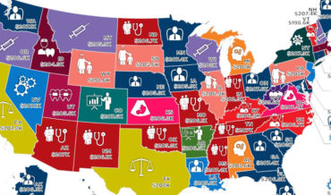
Note: Map has been cut to fit, full size version of the map with key HERE. This is a map created by howmuch.net detailing the median salary for the highest-paying job in each U.S. state. It’s interesting how all the medians are right around $206,000. From what I could gather,
- November 2, 2021
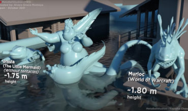
This is a visualization from MetaBallStudio (previously) comparing the sizes of fictional sea monsters from popular culture, including literature, film, and video games. It begins with the diminutive ~5cm Plankton from SpongeBob SquarePants and ends with a 40km Kraken from Warhammer 40,000. I learned a lot by watching it. Mostly,
- October 18, 2021